Read more, dear viewers, because LionKingShirt will explain all of your font concerns.
Choose Legible Fonts
For T-shirts, readability should be the number one font priority. Keep in mind shirt text is seen from much farther away than a book or document designed for close-up viewing. Simple, sans-serif fonts tend to be most readable on tees. Avoid overly thin, delicate, or ornate display fonts, as fine details easily get lost when scaled to shirt size. Instead, opt for simple, bold fonts with clear letter shapes that are easy to quickly recognize. This prioritizes clarity so the message can be grasped instantly when viewed. Some good legible font options for T-shirts include Arial, Helvetica, Futura, Gill Sans, Avant Garde, Franklin Gothic and Akzidenz-Grotesk. Avoid loopy cursive scripts, which are difficult to decipher on fabric. Stick to straightforward, uncomplicated fonts.

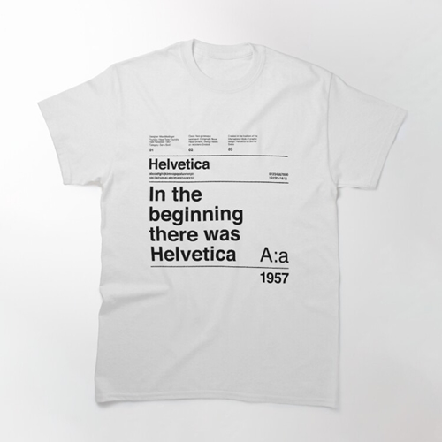
A Helvetica text on a shirt is nothing if not readable
Consider Bold Fonts
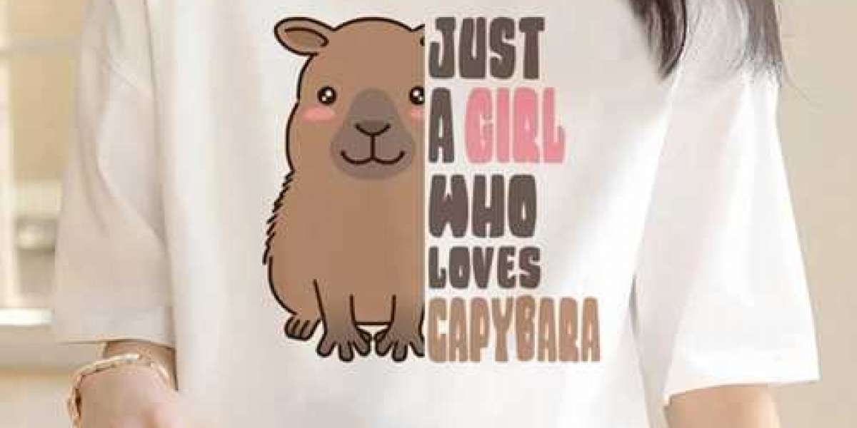
In addition to legibility, opt for bold font choices to maximize impact on Lion King T Shirt. Font weight and letter size both make designs stand out. Bolder fonts also hold up better when shirts are screen printed, compared to thin, delicate fonts, which may get lost. Look for chunky block fonts which convey voice clearly. You should also keep in mind how the color contrasts with the shirt background and affects boldness. Dark inks on light shirts tend to pop most, while light fonts on dark fabrics can get lost. Play with different font weights and color combinations until your lettering grabs attention. Some good bold fonts for T-shirts include Rockwell Bold, Univers Bold, Aviano Bold, Impact, and Neue Haas Grotesk.
Fit the Vibe
Beyond basic readability and boldness, explore fonts that stylistically fit the T-shirt's vibe or message. For example, collegiate fonts like University Roman convey academia for school spirit tees. Dangerous, jagged fonts like Ransom Note effectively communicate edginess. Flowing, funky scripts like Hamburger evoke 70's psychedelia. Research typography styles associated with different eras, cultures or attitudes. Then match the font personality and aesthetics to the shirt's intended theme or purpose. Some eclectic but legible font options include Ostrich Sans, Hamburg, Oxanium, Cloister Black, Birch Std, and Madera. Matching the font to the attitude amplifies the design's overall impact.

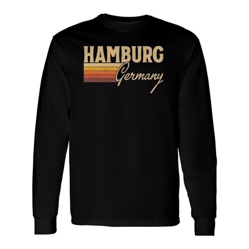
Consider using some old fonts that are still visible
Discover heartfelt designs and colors on POD t-shirts to represent your beliefs proudly in top-quality Lion King Tee Shirts threads!
Keep it Simple
In most cases when designing T-shirts, simple is best for text and typography. Limit font choices to a maximum of 1-3 different styles. Too many clashing fonts create a disjointed, unprofessional feel. Stick to one or two complementary fonts for a clean, consistent look. For multi-line messages, consider using one display font in a larger size to grab focus, along with a more basic sans serif text font for the bulk of the copy. Avoid excessive variations. Too many changes make the overall design feel amateurish.
Additionally, maintain adequate white space around the shirt's lettering so the text does not feel cluttered. Keep margins and spacing between lines generous. Avoid the temptation to cram in lots of words. Allow the message to breathe for increased sophistication. Follow the "Keep It Simple, Stupid" principle when selecting typography for T-shirts.
If elements do not enhance the design, omit them. Finally, proofread carefully to prevent basic text errors that undermine the shirt's polish. Simple does not need to mean sloppy. With careful editing and enough negative space, a limited font palette can create an iconic tee.
Conclusion
All in all, you have just covered the basics when choosing the fonts and typography that will accompany your T-shirts for a long time. If you need more T-shirt advices from the brand, check out the articles at https://www.lexaloffle.com/bbs/?uid=98893.
It’s not always easy to pick out a few fonts among thousands. Each of them stands out in its own way, either in visuals or readability, and you might be overwhelmed at first. But eventually, with enough time and consideration, designers can create statement-making T-shirts that spread memorable messages.
Find More Info: Beautiful Custom POD T-shirt Designs from Lion King Shirt


